Do you remember learning Roy G. Biv in elementary school? This handy acronym helped millions of children remember the colors of the rainbow – red, orange, yellow, green, blue, indigo and violet. While few adults have need to mention Mr. Biv anymore, using acronyms to reference color systems is still common practice, especially when it comes to art and graphics. Knowing what they represent helps you make smart decisions regarding your print projects. Three of the most common acronyms in the world of graphic design are RGB, CMYK and PMS.
RGB
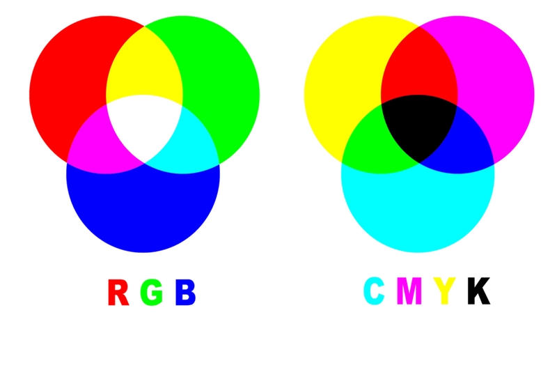
RGB – red, green and blue – is an additive color process. A printer creates an entire spectrum of colors by adding specific quantities of each hue. Mixing equal amounts of all three results in white. The RGB color mode is most commonly seen in electronics such as cameras, scanners and LCD or LED TVs and computer monitors.
Keep in mind that graphics programs such as Adobe Photoshop often set the color mode of a new file to RGB by default. However, most professional printers require you to switch the color mode to CMYK during the prepress process. More on this in CMYK …
CMYK
The origins of the K in this acronym remain a mystery. Some believe it refers to the last letter in the word black. After all, the other letters represent cyan, magenta and yellow, and using B could easily be mistaken for blue. Others think the K stands for key, referring to the key plate used to print fine details in images. These touches were often created with black ink.
CMYK is a subtractive color model, meaning white is created by removing all colors. Reducing amounts of individual hues results in a brighter, more intense version of the ones remaining. For example, removing yellow from magenta creates a bright red.
“Printed graphics look best in CMYK.”
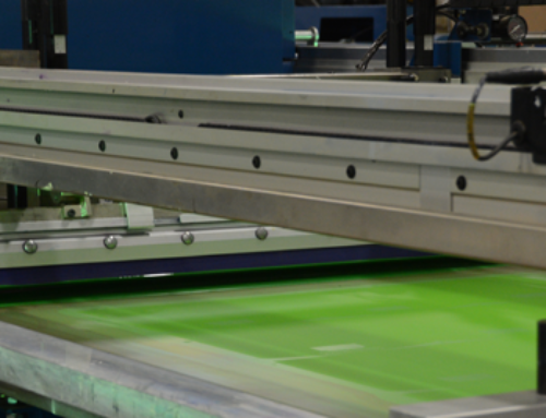
While the RGB model is best for web design, the printing industry uses CMYK to print printed graphics like posters, POP signage and aisle markers. High quality digital printing presses like our Inca Onset Q40i have additional color pigments like light magenta and light cyan (CMYK+LmLc) to expand their color gamut and have smoother color transitions which greatly benefit areas like flesh-tones. A common mistake among new designers is to start creating a graphic using one model and, depending on whether the image is designed for print or web, switching to the other once finished. Unfortunately, RGB and CMYK have subtle differences, and switching modes at the end of the design process alters the look of your artwork. Before starting a new project, make sure the color mode aligns with the prepress requirements of your printing partner.

PMS
PMS is the only acronym of the three that doesn’t refer to a color model. Rather, it stands for Pantone Matching System – a method of determining color consistency across a variety of machines. PMS is used to match ink and other materials to a specific RGB or CMYK color. Developed by a printer in the 1960s, the system describes the specific amounts of different pigments used to create 1,114 spot colors. Without such a standardized method in place, it would be almost impossible for a printing partner to match your brand’s colors exactly. Today, a designer can specify a particular shade of green in their design as a PMS spot color and printers and designers alike understand the exact look the original designer had intended.
If a particular PMS spot color is desired, a screen printing company can generally provide a better PMS color match as screen printing doesn’t rely on combining CMYK pigments to achieve a particular color. This is important to keep in mind when a particular color match is critical.[/fusion_builder_column][/fusion_builder_row][/fusion_builder_container]