The colors selected to be used in a printed graphic can make or break the signage. Using attention-grabbing vivid hues, consistent brand colors and captivating shades not only catch the eye, but are also fundamental in sending the right advertising or brand-recognition message.
Understanding how spot colors and process colors work will help you establish your needs when quoting your next printing project. Spot and process colors have very specific characteristics that ensure your design looks as it’s supposed to and can help lower the cost of your project. While both methods are effective and have similarities in application, they’re more different than they are alike. It’s important to understand the distinctions, so use print suppliers who can offer both options to make sure your graphics look as intended.
Process colors
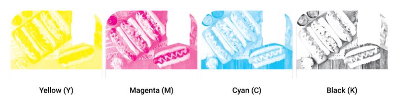
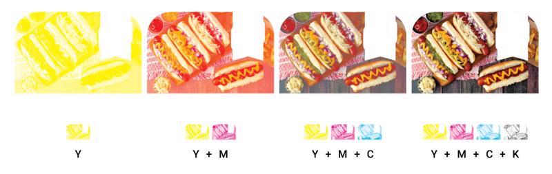
Commonly referred to as four-color or CMYK – short for cyan, magenta, yellow and black – process color printing is used in all forms of printing from screen printing, wide-format digital printing, offset, flexographic, and even in desktop inkjet printers. Process-color printing combines cyan, magenta, yellow, and black in different combinations and ratios to form nearly any color in the visual color spectrum. The example below shows how a graphic image is separated into the four process colors.
 CMYK printing uses these four colors.
Similar to how the primary colors are taught to make other colors (red + blue = purple, yellow + blue = green, yellow + red = orange), process colors use the same concept and take it to another level. The particular combination of CMYK instead of red/yellow/blue expands the color gamut further. By being able to apply ratios of each – such as 10% of cyan, 55% of magenta, 80% of yellow, and 5% of black – makes a completely different color than just orange. The image below shows how
No matter the printing method (screen, flexographic, litho, digital, etc.) they all combine these same process colors at varying degrees of microscopic levels to get the desired color in every tiny area of the image. Using a magnifying glass, you can see the mixture of different ink dots that form the different colors, hues and shades that, when looked at from further away, shows the actual image as intended. Below is an example of what you might see if you zoomed in up close to a four-color process printed graphic like the one above.
While printing a four-color process image is like mixing colors post-print, spot-color printing is quite the opposite and uses pre-mixed pigments prior to printing.
Spot Colors
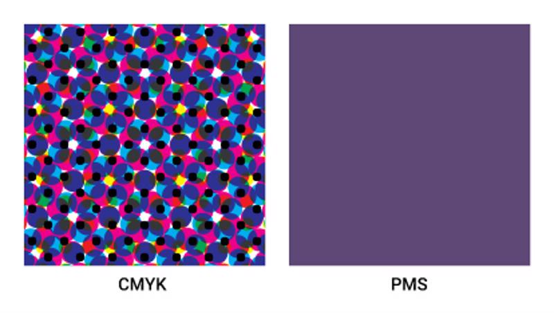
Spot colors are easiest thought of as solid colors that are mixed before printing, similar to how paint is mixed at home-improvement stores. Precisely measured pigments are added to a base and mixed together to perfectly match the intended Pantone color swatch needed in the design.
When you think of iconic brands, you can’t help but identify some without their associated brand specific colors; Coca-Cola red, UPS brown, or Tiffany blue. They all have a very precise Pantone hues that must be right to maintain brand consistency. Additionally, many brands have unique colors that fall outside of the achievable CMYK color gamut like Kawasaki green or Home Depot orange. To recreate these distinct hues and ensure they remain uniform across all medias, printers and sizes, they should be printed using a single spot color rather than a blend of CMYK process colors. Because the fill area is a smooth single color, instead of an inconsistent blend of CMYK throughout the run and not sharp up close, spot colors are ideal for solid fill areas in design.
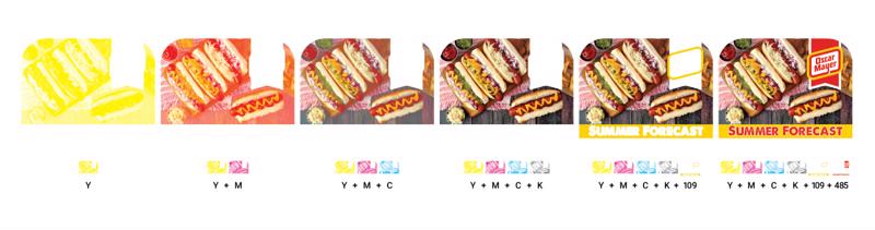
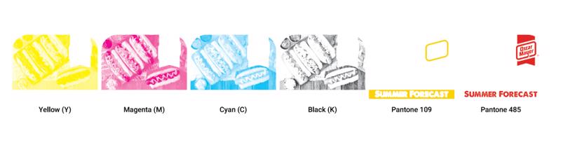 Process colors can also be used with spot colors. Our Oscar Mayer image above will also use two brand-specific spot colors.
It’s important to note that printing in spot and process colors is not mutually exclusive and they can be used together to compliment the design in the best way possible. A classic example is an image that requires process inks but that includes large gaps to fill within the sign. This is similar to our earlier example where we printed the hot-dog image in process, but this will show the logo as two custom spot colors because they were identified as critical.
There are other advantages to spot colors as well. Since they are not a mixture of process CMYK colors, unique pigments and additives can be included in the ink mixture to expand the color gamut and add special effects. At Hopkins Printing, we are capable of spot-color printing gloss and matte clears, metallic colors, transparent colors, glitter, florescent colors, and most importantly, white. White is especially important because it doesn’t fit into the CMYK color spectrum, but is essential for printing on clear substrate materials.
Spot colors can also be more efficient and cost effective than printing in process. For example, when printing a two-color brand logo, the graphic will have a faster setup time, will use two less screens, and will need less ink than if the logo was printed in four-color process.

Why NGS Printing
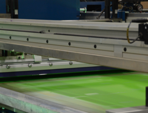
In addition to the industry’s most state-of-the-art wide format digital presses, Hopkins Printing is home to multiple six-color silk-screen printing presses that can handle a four-color process image as well as two-spot colors at the same time. As a perennial qualified G7 Master leader in color-proofing, screen printing and digital printing, Hopkins Printing has the experience, precision and attention to detail that make us an authority in the point-of-purchase graphic industry.
To learn more about all that we can do for you and the other intricacies between spot color and CMYK, contact us online or by phone at (847) 741-4411.[/fusion_builder_column][/fusion_builder_row][/fusion_builder_container]