Windows are useful in a storefront. They provide a view into the interior store, allowing the shopper to see what the provider offers without having to step inside. Yes, windows are a marvel at being transparent, allowing the eye to wander from the road ahead and into a retail setting.
But this was before smartphones. Now, windows need help. Consumers’ phones are full of bright visuals that pop and shake all over the screen. While even the best window clings cannot move, they can compel consumers to look up once and a while. In order to take full advantage of this style of window signage, retail space owners should keep a few things in mind: time is precious, appeal to emotion, and choose your colors wisely.
Illicit a strong emotional connection
According to the Harvard Business Review, the companies that succeed make an emotional connection with the consumer. Rather than appealing to the rational mind, retailers should entice shoppers in by equating a product to an emotion. This is hardly new. Certain truck commercials have been showcasing strength with a gruff cowboy narrator to compare owning the vehicle with an idea of independence, not to stress certain specs.
Window clings can do this too – after all, a picture is worth a thousand words. Consumers want images that say individuality, that inspire an idea of freedom or promote security. Find a fear and equate the product with salvation – it’s been done for decades. Window signage of all kinds has been made to capitalize on this emotional effect.
Know which color relates to which emotion
Of course, the devil is in the details. A Kissmetrics infographic showed that color, far more than any other factor, mattered when it came to making a buying decision. And ideally the consumer should be convinced to buy before entering the store or, more importantly, despite whatever the price tag says. So let’s do a quick run down. Here’s a short guide to which emotions are commonly associated with each color:
- Black – power, streamlined and sleek, used to promote a lot of cutting edge technology. A lot of gaming and PC window graphics utilize this.
- Blue – promotes feelings of security and trust, think of a companies like Intel or Ford.
- Green – the color of money and therefore the unconscious symbol of wealth.
- Orange – used primarily for a call to action since it is seen as a very aggressive color.
- Pink – still the color of femininity and romance. A lot of stores aimed at women use window signage in this color.
- Purple – very calm and relaxing, purple soothes most of the people who look at it.
- Red – speeds the heart-rate and gets the energy flowing, hence why it’s used so often for clearance sales.
- Yellow – here it is, the window graphics’ best friend. Yellow is the color most often used in displays since it draws the eye with feelings of happiness and positive energy.
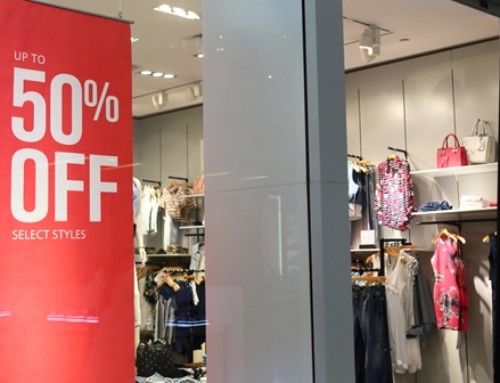
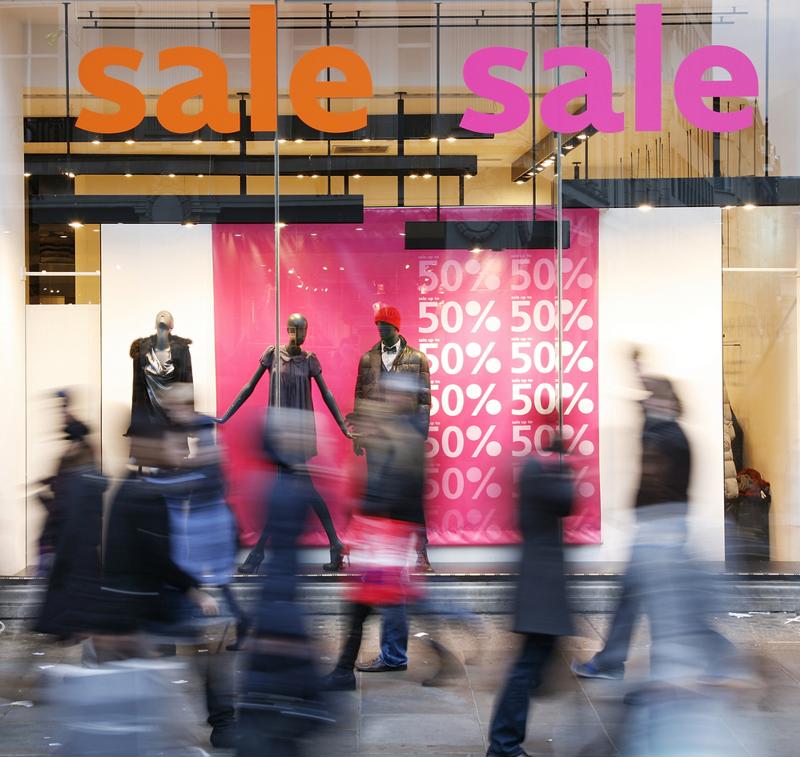 Here you see the colors pink, red and orange being used. Likely a sale on men and women’s clothing.
So there you have it. Want a window cling that stands out? Go for a combination of a product-related color and yellow. A product like sunscreen would likely benefit from blue and yellow whereas the new sports watch might do better with a black and gold pattern. Make your windows graphics’ color match your desired intent.
Regardless, keep reading to a minimum. Remember that the audience has a smartphone, headphones and a multitude of other devices all fighting for attention. Communicate everything quickly and clearly. Windows used to be great for their transparency, now that is an insult. The best windows should be as eye-catching as posters or paintings.