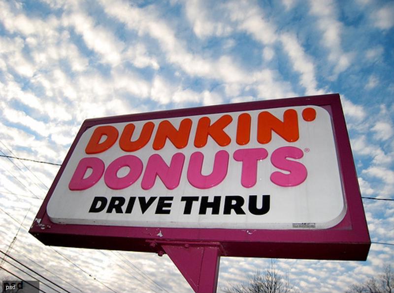
Although its taste-tantalizing pastries aren’t going anywhere, a New England-based quick serve restaurant is doing away with its “Donuts” tagline to freshen its look and inform would-be clientele it serves much more than crullers and bear claws.
Starting in January, Dunkin’ Donuts will shed its “Donuts” moniker and become known simply as “Dunkin’,” the company announced recently. In so doing, the fast food giant plans to implement a signage overhaul to make the move official, changing up its floor graphics, banners, graphic overlays, standees and window graphics, among other printed materials.
Tony Weisman, chief marketing officer at Dunkin’, indicated that by revamping packaging and various forms of signage, the company is both recasting itself but also paying tribute to its loyal customer base, many of whom refer to it as “Dunks” or “Dunkiles.”
“By simplifying and modernizing our name, while still paying homage to our heritage, we have an opportunity to create an incredible new energy for Dunkin’, both in and outside our stores,” Weisman explained in a press release. “We are bringing the iconic name Dunkin’ to the forefront in a bold way that brings to life how we refill optimism with each cup and bring fun, joy and delight to our customers each and every day.”

Serves much more than pastries and java
Dunkin’ has quite the variety of food and beverage options, one that’s grown increasingly eclectic since its founding back in 1948. In addition to donuts, the company serves coffee, lattes, capucchinos, macchiatos, tea, hot chocolate, muffins, bagels and breakfast sandwiches, among other offerings. The packaging and labeling on drink cups, bags and coffee holders will also get the makeover treatment.
Dunkin’ President David Hoffmann said he’s excited about the signage and branding transformation – and there’s more to come.
“Our new branding is one of many things we are doing as part of our blueprint for growth to modernize the Dunkin’ experience for our customers,” Hoffman noted. “From our next generation restaurants, to our menu innovation, on-the-go ordering and value offerings, all delivered at the speed of Dunkin’, we are working to provide our guests with great beverages, delicious food and unparalleled convenience.
Hoffman went on to say that he believes the company’s move to modernize will keep it a go-to destination not just for early-risers seeking their morning coffee, but in the afternoon and evenings as well.
Other companies that have rebranded
Dunkin’ certainly isn’t the only household name chain to reconfigure its signage. Kentucky Fried Chicken transitioned to KFC in 1995 and four years later, Boston Chicken turned into Boston Market, as noted by Vox.
A signage overhaul is a major endeavor that can be a challenge. Hopkins Printing gets the job done right. Big or small, Hopkins handles them all, whether for in-store promotions or exterior publicity, such as concrete graphics and yard signs. Please contact us to request a quote.


