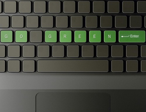
At the end of every year, Pantone, creator of one of the world’s most iconic color-matching systems, unveils a new color to symbolize the coming 12 months. According to the company, each annual selection represents the cultural attitude of the time it’s chosen. The choice for 2017 is Greenery – a lush yellow-green evoking spring, nature and renewal.
Unlike 2015’s Marsala, Greenery is a shade already synonymous with certain emotions and attitudes in the world of marketing. Consumers everywhere automatically – perhaps even unconsciously – associate the hue with nature and feelings of warmth, happiness and serenity. Below are three powerful ways to incorporate Greenery into your 2017 marketing strategy:
1. To accent other colors
Unless the brand or product in question is associated with nature, environmentalism or a similar concept, avoid using Greenery as the primary color in your graphics. Instead, use it as an accent color to complement other hues like reds, pinks and yellows. For example, although the Hopkins logo is green, we use gray, white and other colors to create a harmonious website. Greenery can be visually overwhelming if takes up the majority of your graphic, so it’s best used sparingly.
In fact, this aspect makes Greenery a great choice for emphasizing certain text. A giant paragraph in this color is difficult to read, but a single green word in a bold, sans serif font pops out when juxtaposed against neutrally colored passages.
2. To revitalize a brand
As Pantone explained, Greenery symbolizes new beginnings. The shade encourages feelings of hope, opportunity and promise. As such, it’s the perfect color to complement a brand’s relaunch. Use Greenery in temporary ad campaigns to highlight new products, strategies or logos. This increases the feeling of novelty and gets consumers excited about your company. Greenery doesn’t need to replace a brand’s signature color – in fact, such a sudden switch confuses customers and ultimately does more harm than good. Rather, it should be used alongside existing elements so as to evoke innovation without compromising brand recognition.
Greenery is also a great choice to pair with your environmental initiatives. For example, Hopkins uses green colors to showcase our commitment to using eco-friendly printing processes.
3. To soothe consumer anxiety
Green has always been associated with positivity. A green traffic signal means “Go,” and the yellow-green spectrum on a weather map represents milder, comfortable temperatures. This detail, AdWeek noted, makes Greenery the perfect color to counter the turbulent social landscape of 2017. Using this hue in your marketing makes your business feel like a calm refuge in a world where breaking news alerts crop up on an hourly basis. Customers will be more likely to shop from your store in order to escape their daily stressors.